Part 2 - Data Ingest and Plotting

Introduction
Now that we have Python setup within Anaconda, let’s use it for some science! Here, we will plot data using matplotlib and xarray, which will require data wrangling using NumPy, and pandas. Through this process we will build a skillset fundamental to (geo)data science that can be applied to a variety of fields outside of the geosciences.
If you’re following along in this tutorial series, there’s no need to install any Python modules in Anaconda as the previous tutorial made sure that the environment we created had the entire scientific Python stack installed. So, let’s open up Jupyter Lab and create a new Jupyter Notebook to hold the code that we’ll be writing today.
Time series plotting with matplotlib
Within our notebook we’ll need to call the three packages that we need and this can be accomplished with this code chunk:
import matplotlib.pyplot as plt
import numpy as np
import pandas as pd
Within this code, we call the matplotlib Pyplot module into the Python instance as plt, so we will access all functions by including the prefix plt. and then typing in the function we want (e.g. plt.scatter for a scatterplot or plt.plot for a line plot). This same syntax is used to import NumPy and pandas and their associated functions.
With the modules we need in place, let’s ingest a timeseries of global mean annual temperature through time and plot it.
First let’s start ingesting the csv by calling pd.read_csv and providing it with the URL of the HadCRUT5 time series. Note, that pandas has many functions and can readily ingest data from Excel and text data without a problem.
# Read in csv from the HadCRUT5 dataset
hadcrut5 = pd.read_csv("https://www.metoffice.gov.uk/hadobs/hadcrut5/data/current/analysis/diagnostics/HadCRUT.5.0.1.0.analysis.summary_series.global.annual.csv")

# Lets take a look at the first and last 5 rows of the data using pd.head()
# This tells us what the data looks like and the column names which we need to plot the data
hadcrut5.head
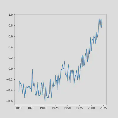
With the dataset imported and stored as the hadcrut5 variable, lets plot it. But first, lets get some terminology out the way. matplotlib creates “figures” that are composed of “subplots”. This structure is very powerful as it allows you to stitch together any plots you want within the same figure, as long as they’re separate subplots. Here, we will be creating a single figure composed of a single subplot which is apparent in the code. For a thorough explanation of how to use matplotlib to create more complicated visualizations see this guide. Since we are only making a single time series plot, this code can be shortened quite a bit, but I’ve chosen to leave it verbose to get you thinking about matplotlib plots as a collection of subplots because that’s a key feature of matplotlib.
# Create figure instance
fig = plt.figure(figsize = (6, 6)) # Figure size width, height in inches.

# Add subplot to figure instance and name it ax
ax = fig.add_subplot(111) # 111 means "1x1 grid, first subplot"

# Plot
ax.plot(hadcrut5['Time'], hadcrut5['Anomaly (deg C)'])
Notice how we call the ‘Time’ and ‘Anomaly (deg C)’ columns that we uncovered by running hadcrut5.head using brackets next to the pandas data frame variable name that we assigned earlier. The same can be accomplished by typing in hadcrut5.Time, but using the bracket notation is preferable in case you have column names with spaces, as in 'Anomaly (deg C)'.
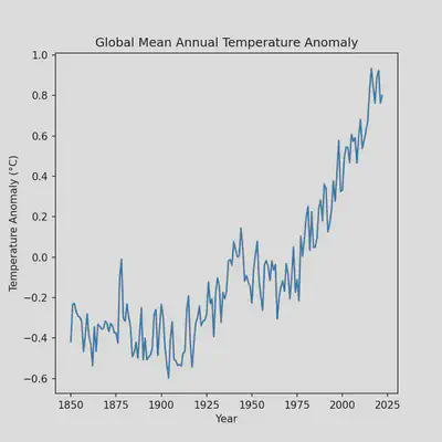
Our plot still look’s a bit rough so lets polish it by adding axis labels and a title:
# Create figure instance
fig = plt.figure(figsize = (6, 6)) # Figure size width, height in inches.

# Add subplot to figure instance and name it ax
ax = fig.add_subplot(111) # 111 means "1x1 grid, first subplot"

# Plot
ax.plot(hadcrut5['Time'], hadcrut5['Anomaly (deg C)'])

# Subplot title
ax.set_title('Global Mean Annual Temperature Anomaly')

# X-axis label
ax.set_xlabel("Year")

# Y-axis label
ax.set_ylabel("Temperature Anomaly (°C)")
The plot is looking quite a bit better but we can still improve it by removing some whitespace which will require modifying some existing code that we have. Namely, the line that we call the figure instance.
# Notice how we've added the 'constrained_layout' argument and set it to true
fig = plt.figure(figsize = (6, 6), constrained_layout=True)

# Add subplot to figure instance and name it ax
ax = fig.add_subplot(111) # 111 means "1x1 grid, first subplot"

# Plot
ax.plot(hadcrut5['Time'], hadcrut5['Anomaly (deg C)'])

# Subplot title
ax.set_title('Global Mean Annual Temperature Anomaly')

# X-axis label
ax.set_xlabel("Year")

# Y-axis label
ax.set_ylabel("Temperature Anomaly (°C)")
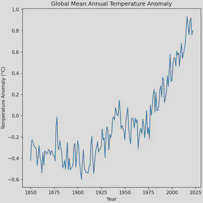
The plot is almost perfect, however the automatic x-ticks generated by matplotlib make it seem as the though the data extends to the year 2025 when it ends at the year 2022. Changing this portion of the plot will require using NumPy to produce a 1-dimensional array (1D vector) of the x-ticks that we want. We can make the process a bit easier by making use of a handy function in NumPy that makes arrays for us of a sequence of numbers, np.arange. The function has the arguments start for the starting number of the sequence, stop for the last number of the sequence, and step for the step size to take in the sequence. We’ll start our sequence at 1850, end it at 2022, and take steps of 21.5 years. Unfortunately, using a step size of 21.5 will produce numbers with decimal points, which we can fix by appending the .round() function to the np.arange call.
# Create figure instance
fig = plt.figure(figsize = (6, 6), constrained_layout=True)

# Add subplot to figure instance and name it ax
ax = fig.add_subplot(111) # 111 means "1x1 grid, first subplot"

# Plot
ax.plot(hadcrut5['Time'], hadcrut5['Anomaly (deg C)'])

# Subplot title
ax.set_title('Global Mean Annual Temperature Anomaly')

# X-axis label
ax.set_xlabel("Year")

# Y-axis label
ax.set_ylabel("Temperature Anomaly (°C)")

# X-axis ticks
ax.set_xticks(np.arange(start=1850, stop=2023, step=21.5).round())
Although, I only gloss over it, NumPy is a critical package for scientific computing. It allows for the easy creation and manipulation of N-dimensional arrays necessary for machine learning, linear algebra, and climate model analysis (which we will get to in the next tutorial).

Plotting spatial data with xarray
As Earth scientists we commonly work with spatial data which brings its own set of challenges for data analysis and visualization. We often have to contend with geographical coordinated systems (CRS), data in 4 dimensions (time, latitude, longitude, altitude), paleogeography, among many other complications. These issues require their own blog posts and for simplicity, we will ignore all of these issues. Our goal will be to download a dataset that has a spatial component using xarray and plot it.
As with the previous section of this tutorial, let’s begin by loading xarray into our Python shell.
import xarray as xr
Now let’s download the spatially explicit global mean annual temperatures from GISTEMP v4, the counterpart to the time series plot we just made. Unlike pandas, xarray does not support reading files off of the internet (this is only half true, but to keep things simple we won’t worry about it), so we’ll have to manually download the data and put the data file in the correct location to read it into Python using xarray. Download the HadCRUT5 netCDF file from here and place the file in C:\Users\ on Windows or ~/ on MacOS and most Linux distributions.
# Read in file - if you get an error here, it likely means the file is not in the correct location
hadcrut5_spatial = xr.open_dataset("HadCRUT.5.0.1.0.analysis.anomalies.ensemble_mean.nc")

# Let's take a look at the data structure
hadcrut5_spatial

<xarray.Dataset>
Dimensions:           (time: 2073, latitude: 36, longitude: 72, bnds: 2)
Coordinates:
  * time              (time) datetime64[ns] 1850-01-16T12:00:00 ... 2022-09-16
  * latitude          (latitude) float64 -87.5 -82.5 -77.5 ... 77.5 82.5 87.5
  * longitude         (longitude) float64 -177.5 -172.5 -167.5 ... 172.5 177.5
    realization       int64 100
Dimensions without coordinates: bnds
Data variables:
    tas_mean          (time, latitude, longitude) float64 ...
    time_bnds         (time, bnds) datetime64[ns] 1850-01-01 ... 2022-10-01
    latitude_bnds     (latitude, bnds) float64 -90.0 -85.0 -85.0 ... 85.0 90.0
    longitude_bnds    (longitude, bnds) float64 -180.0 -175.0 ... 175.0 180.0
    realization_bnds  (bnds) int64 1 200
Attributes:
    comment:      2m air temperature over land blended with sea water tempera...
    history:      Data set built at: 2022-10-20T13:33:18+00:00
    institution:  Met Office Hadley Centre / Climatic Research Unit, Universi...
    licence:      HadCRUT5 is licensed under the Open Government Licence v3.0...
    reference:    C. P. Morice, J. J. Kennedy, N. A. Rayner, J. P. Winn, E. H...
    source:       CRUTEM.5.0.1.0 HadSST.4.0.0.0
    title:        HadCRUT.5.0.1.0 blended land air temperature and sea-surfac...
    version:      HadCRUT.5.0.1.0
    Conventions:  CF-1.7
We’re particularly interested in the Dimensions and Data variablesbecause that dictates how we will plot the data - we have 2073 time steps (monthly data) on a grid that is 72 longitude cells by 36 latitude cells. Importantly, the data we are interested in is within the tas_mean data variable. Plotting 2073 time steps of temperature anomalies isn’t very informative, so let’s simplify this data by taking the average of the last decade. To do so, let’s first take annual averages for the entire dataset and then average over the last 10 years. Note, there are more elegant ways to write this code, but we’re trying to keep things simple. Additionally, I’m choosing not to introduce the .groupby(), .sel(), and .slice() functions, which will be introduced in a later tutorial.
# First take the annual mean
# Note, that this is *not* weighted by days in each month for simplicity
hadcrut5_annual_mean = hadcrut5_spatial['tas_mean'].groupby("time.year").mean("time")

# From annual means, let's take the average of the last 10 years
hadcrut5_last_decade = hadcrut5_annual_mean.sel(year=slice(2012, 2022)).mean("year")
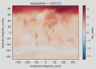
We now have our average of the last 10 years of HadCRUT5, so let’s plot the data. We have three options for how to do so: 1) plotting with xarrays built in .plot() function, 2) manually plotting the data using matplotlib, or 3) create subplots with matplotlib but plot using xarray. Option 1 is incredibly simple and great for quickly visualizing the data but has limited customization. Option 2 requires a bit more code but is much more customizable - figure size and subplot orientation can be readily changed.
# Option 1 --------------------------------------------------------------------
hadcrut5_last_decade.plot()
Produces:
# Option 3 --------------------------------------------------------------------
# Create figure instance
fig = plt.figure(figsize = (8, 5))

# Add subplot to figure instance and name it ax
ax = fig.add_subplot(111)

# Plot - notice how we add the ax argument and point it to our created subplot
hadcrut5_last_decade.plot(ax=ax)
Produces:
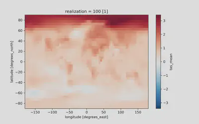
In both plots we can make out the fundamental features of contemporary climate change! The Arctic is warming faster than the rest of the Earth and land masses are warming faster than the oceans. Neither of these visualizations are publication ready, so stay tuned for further tutorials on how to produce a polished, publication-ready figure! For homework, use what was introduced in the Time series plotting with matplotlib section to reduce the amount of whitespace, rename axis labels, rename the plot, and rename the colorbar label.
Be on the lookout for Part 3 which will more comprehensively introduce the power of xarray for handling spatial data.
David Fastovich
Postdoctoral Scholar in Paleoclimate Dynamics
My research interests are focused on understanding past global change using proxies and models.